This is the first of what I hope will be a series of posts comparing Altair and Bokeh. Both are actively supported python packages for making interactive visualizations. This post will only scratch the surface, but is intended to show the basic differences in how they approach creating visualizations. (Update: you can now also read Part 2 and Part 3).
To begin, let's create some data and a basic bar chart in matplotlib, as a baseline, and include the output as a png image below.
import matplotlib.pyplot as plt
import pandas as pd

data = pd.DataFrame({
    'Category': ['A', 'B', 'C', 'D', 'E'],
    'Value': [15, 28, 10, 34, 22]
})

plt.bar(data['Category'], data['Value'])
plt.savefig('matplotlib1.png', bbox_inches='tight')
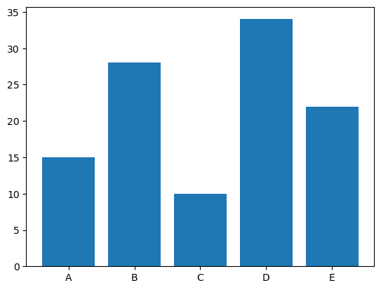
matplotlib makes fairly reasonable choices, including how it sets the overall canvas size, scales the y-axis, orients the x-axis ticks, and colours the bars.
In contrast to matplotlib, Altair has a very different style, inspired by the grammar of graphics. We first tell it what type of mark we to use (bars), and then what data is being encoded to which channels. In addition, we can use the chained notation which feels much more like javascript. Most importantly, the plot will be rendered by the vega library, so we can embed the chart object in this post, such that the figure below is actually an interactive object (click the three dots to see more).
import altair as alt

# Plot the data using Altair
chart = alt.Chart(data).mark_bar().encode(
    x='Category',
    y='Value'
)
chart
Bokeh, on the other hand, has a syntax that is much more like matplotlib. We can similarly create a basic bar chart, without making any attempt to style it yet, and see how it compares. Interestingly, Bokeh makes this plot interactive by default, so you can pan and zoom the chart below:
from bokeh.plotting import figure, show, output_file, save
from bokeh.io import output_notebook, reset_output

# Create the Bokeh figure
p = figure(x_range=data['Category'])

# Add the bars
p.vbar(x=data['Category'], top=data['Value'])

show(p)
As a first pass, neither of these plots looks all that great. The Altair plot seems too tall and narrow, and the x-tick labels should be rotated (although it does add axis labels automatically, which could be nice). The Bokeh plot is better on both of those points, but there is no space between the bars, and it's kind of weird to not have the y-axis start at 0 for a plot like this. The Bokeh plot also seems too large overall, and doesn't have any axis labels.
Both Bokeh and matplotlib default to the Category 10 colour scheme, whereas altair using Tableau 10 by default, which is the same default colour scheme used by Seaborn. We could easily change these colours of course, but I'll keep them the same below, to help distinguish between the two types of plots.
Naturally, we can modify all these chart properties. For Altair, lets reorient the x-axis tick labels, remove the x-axis label, and set the width and height of the plot. For the first two, we'll need to explicitly wrap the x channel as an altair X channel (enabling attributes like title and axis properties), whereas for the latter, we'll set the relevant chart properties.
# Make an updated Altair figure
chart = alt.Chart(data).mark_bar(
).encode(
    x=alt.X('Category', title=None, axis=alt.Axis(labelAngle=0)),
    y=alt.Y('Value')
).properties(
    width=200,
    height=300
)
chart
For the Bokeh plot, lets make it more like the Altair one by turning off the interactive tools, setting the width and height, changing the y-axis range, adding a label to the y-axis, removing the x-grid lines, and reducing the width of the bars.
# make an updated Bokeh figure with a set size and no interactive tools
p = figure(x_range=data['Category'], width=200, height=300, toolbar_location=None, tools="")

# plot narrower bars
p.vbar(x=data['Category'], top=data['Value'], width=0.85)

# Set the y-axis range
p.y_range.start = 0
p.y_range.end = 35

# add a y-axis label
p.yaxis.axis_label = 'Value'

# remove the x-axis grid
p.xgrid.grid_line_color = None

show(p)
There are still some differences between the two: specifically there are differences in font size and style, as well as in the y-axis ticks. However the overall differences have been drastically reduced, and both now look much better than the default matplotlib plot.
Interestingly, it also appears that in Altair, the width and height control the size of the plot area, whereas for Bokeh they control the overall figure, including ticks, labels, etc. As a result the Bokeh plot ends up being slightly smaller, even though we have given them the same size parameters.
This has obviously been an extremely limited (initial) exploration of these two packages, but even from these quick tests, it's clear that there are some trade-offs between the two. The most obvious difference is the style and syntax of how to write plotting code. Beyond that, however,
- the Altair code seems more compact and elegant, whereas Bokeh seems more like a collection of disparate elements; that being said, this also possibly makes the Bokeh easier to comment;
- the Altair defaults arguably seem a bit better, at least for a basic bar chart, but both require some customization to look reasonable;
- although it's not directly shown by the above, exporting the plots to HTML results in a much more compact representation for Altair than for Bokeh (check the source for this page for details).
In the end, I expect that Bokeh will ultimately prove more powerful due to it's ability to integrate python callbacks. However, for a wide range of plots, it feels that Altair may be the nicer option so far.